The brief
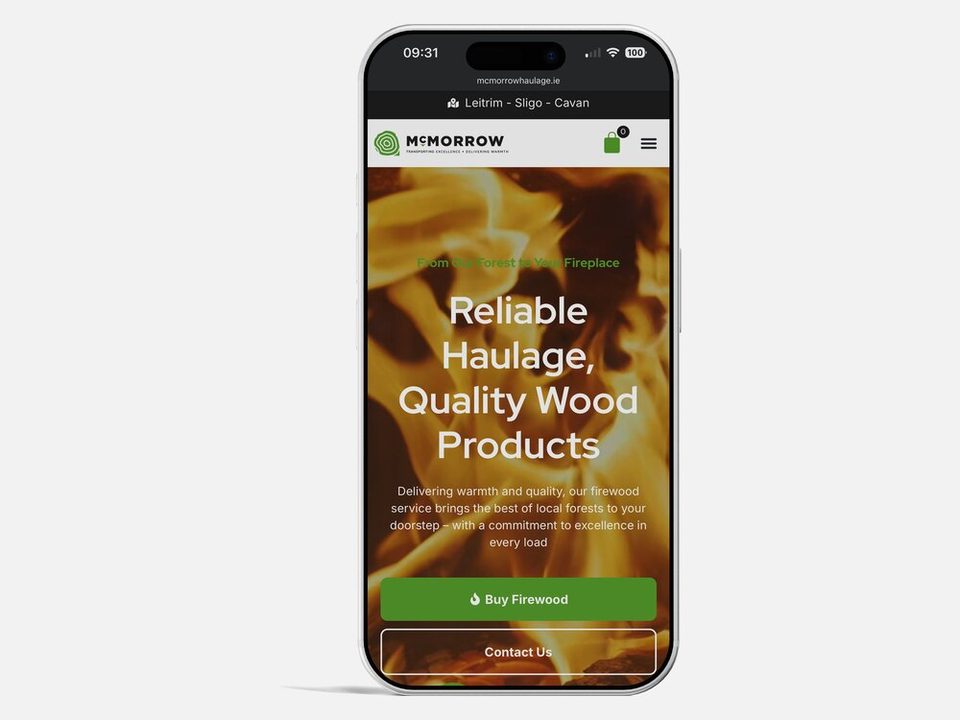
McMorrow Haulage is a family-run haulier based in Dowra, Co. Leitrim, and one of Ireland's leading names in timber and forestry transport. Running since 1997, they've built their reputation moving timber the length of the country with a fleet of specialist trucks and trailers built for rough forest ground. They wanted a refreshed brand identity that still felt like them, trustworthy, durable, proud of where they're from, but that worked properly across everything from truck livery to a business card.
What we did
- Discovery sessions to understand the company's history and values
- A robust new logo, a strong wordmark paired with an emblem
- A grounded colour palette with a vibrant accent
- Brand guidelines to keep everything consistent
The result
A confident, hard-wearing brand that looks as at home on the side of a truck as it does on a letterhead, giving McMorrow Haulage a consistent, professional presence wherever their name shows up, from a forest road in the North-West to a customer's inbox. It's the kind of brand and identity work we take on for established businesses ready to sharpen how they look without losing who they are.
Like what you see?
Tell us about your project and we'll come back within a day with a fixed-price proposal and an honest read on whether we're the right fit.
Book a 30-min call